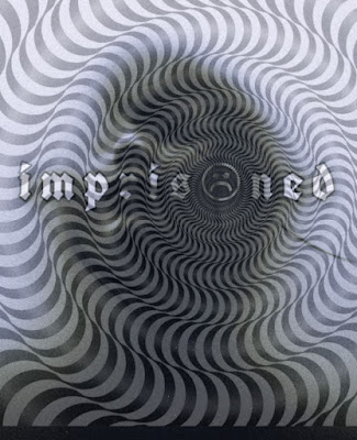
Planning for the Final Task: Title Design
- Font: For every title card the font will be the same so it remains consistent. I will be using a font that matches my theme. Usually, in thrillers, the font is either really simple or has a scary feel to it.
- Contrast: I will make my title lighter than the background images so the audience can read it easily. In my example, it is not shown this way but I will adjust it later on.
- Size: The title will appear in bold font and big enough for the audience to read.
- Spacing: There will be spacing in between the letters also for the audience to read better.
- Working title: The title of the movie is "Trapped" or "Imprisoned". I choose this title for now because it describes how the character feels.
- How will the titles enter the screen? The titles will pop up on a new scene and then fade away.
- How long will each title be before it disappears? Each title will be 3-5 seconds because it's fast-paced. This ensures the audience will get immersed.
- All titles will be edited into the film and will appear on the screen fast. The title cards will appear in between scenes of the m/c running. This will be done with the use of cross-cutting.
Additionally, I'm taking inspiration from the photo edit I made based off of my opening sequence. This will further help me decide what my title will look like eventually. Also, from my previous research, I'm taking inspiration from the movie Split. The opening sequence was very chilling and face-paced. It made the audience uneasy and I want that same effect with my title cards.


Comments
Post a Comment